Blog / After Hours / Since ’96
My Website, Redesigned Every Year Since I Was Born
I rebuilt my homepage the way it would have been built every year since 1996, the year I was born.
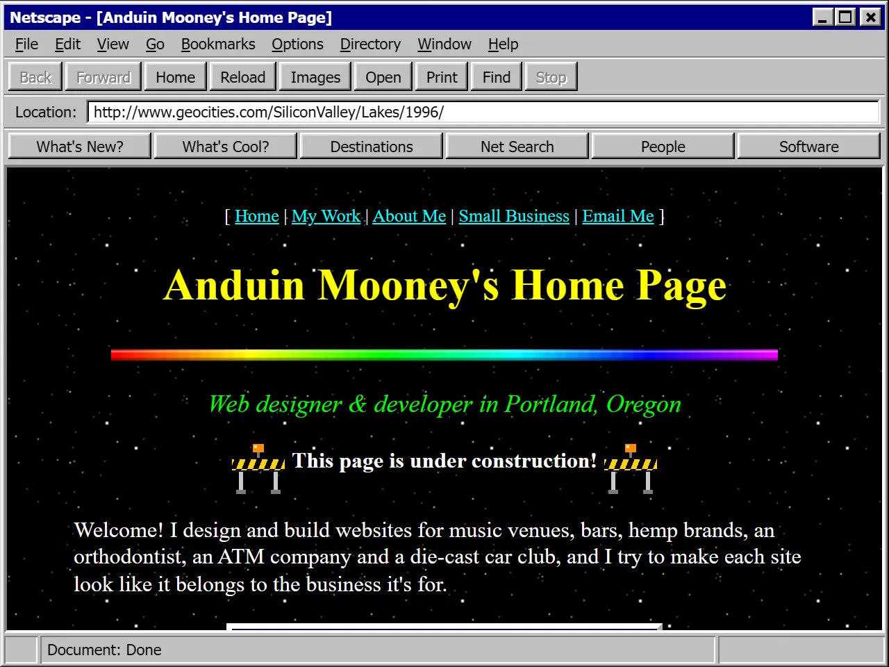
Home pages Netscape Navigator 3.0 · Windows 95 · 640 × 480 · 28.8k modem
Netscape Navigator 3, a 640 by 480 screen and a 28.8k modem. Also the year I was born.
- ’96
- ’97
- ’98
- ’99
- ’00
- ’01
- ’02
- ’03
- ’04
- ’05
- ’06
- ’07
- ’08
- ’09
- ’10
- ’11
- ’12
- ’13
- ’14
- ’15
- ’16
- ’17
- ’18
- ’19
- ’20
- ’21
- ’22
- ’23
- ’24
- ’25
- ’26
- Home pages
- Frames
- Flash
- Slices
- Web standards
- Web 2.0
- 960 grid
- Responsive
- Flat
- Mobile first
- CSS grid
- Dark mode
- Dribbble
- Now
- What it is
- My homepage, rebuilt for every year from 1996 to 2026
- Versions
- 31, each in the browser people used that year
I was born in 1996. That year most people met the web through Netscape Navigator, on a 640 by 480 screen, over a 28.8k modem that tied up the phone line. I’ve been building websites since 2018, and I got curious what my own homepage would have looked like if I’d been making it the whole time.
So I rebuilt it for every year from 1996 to 2026. That’s 31 versions, each one running inside the browser people used that year, from Netscape 3 on Windows 95 to Safari on an iPhone. Each one is also written the way it would have been written then: uppercase FONT tags and spacer GIFs in 1996, a frameset in 1997, a Flash movie in 1999, Dreamweaver slices in 2002, CSS floats in 2004 and so on, up to the CSS we have now. It lives on my After Hours page as Since ’96, and the scrubber at the top of this post runs through all of it.
Here’s the history of web design as it played out on one homepage, era by era.
1996: the personal home page
The first version is the kind of page GeoCities was full of. It has stars on a black background, a yellow title in Times New Roman, a rainbow divider, an under construction sign, a hit counter and a link to sign my guestbook. The layout is a table, and the spacing comes from spacer.gif, a transparent image stretched to whatever size the gap needed. Style sheets barely existed yet, so every color and font was set with a FONT tag, one tag at a time.
1997 and 1998: frames and Dynamic HTML
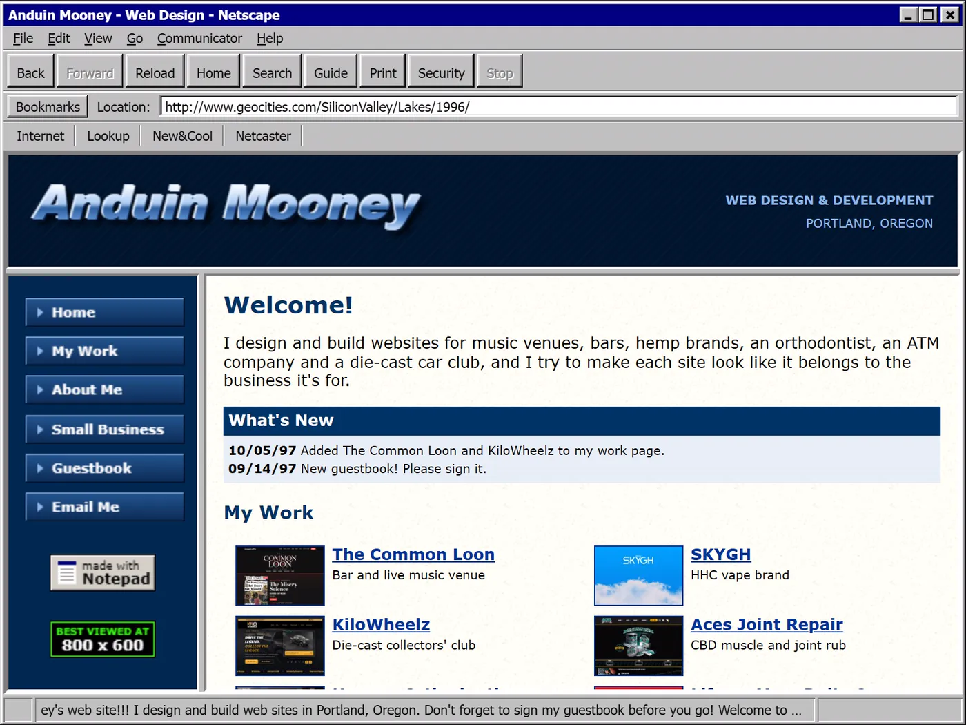
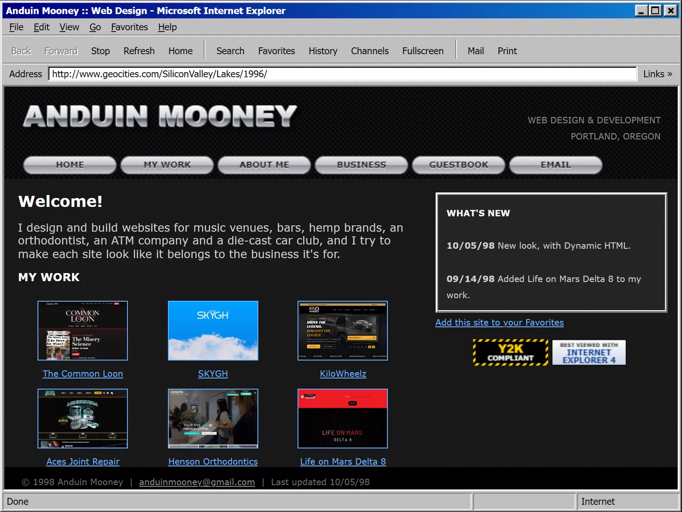
Frames split the browser window into separate HTML pages. The menu lived in a narrow frame on the left and stayed put while the main frame changed next to it, which felt like a big deal at the time. Screens grew to 800 by 600. By 1998 Internet Explorer 4 and Netscape 4 both supported Dynamic HTML, so a page could move things around after it loaded, and a lot of people used that to put a trail of stars behind the mouse. My 1998 version has one.
1999 and 2000: Flash sites and Skip Intro
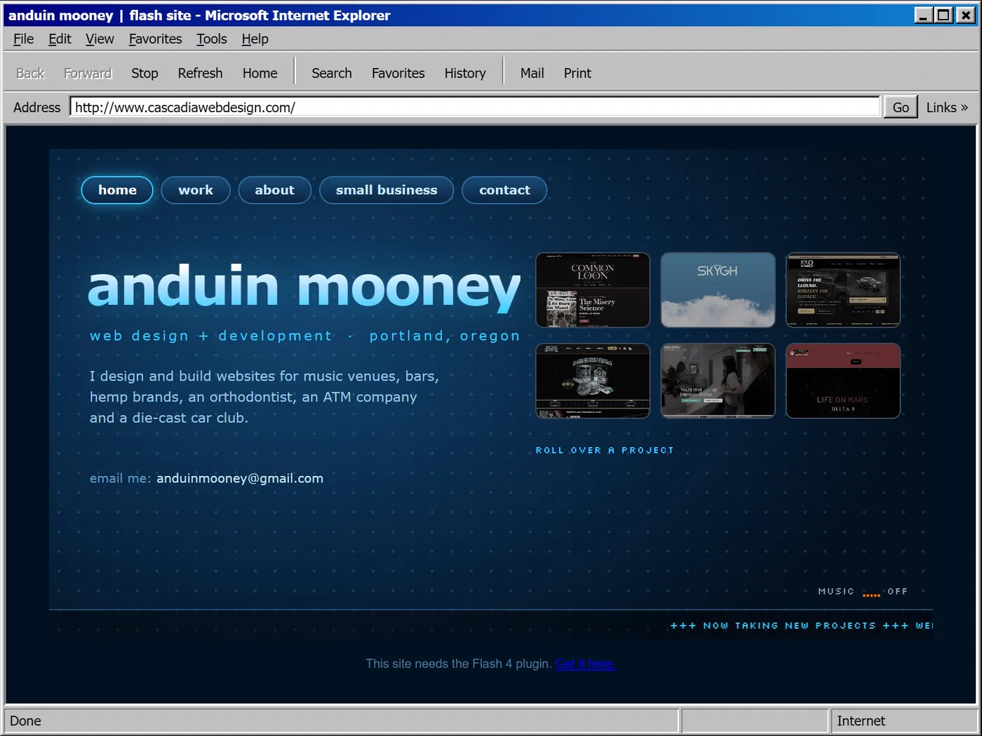
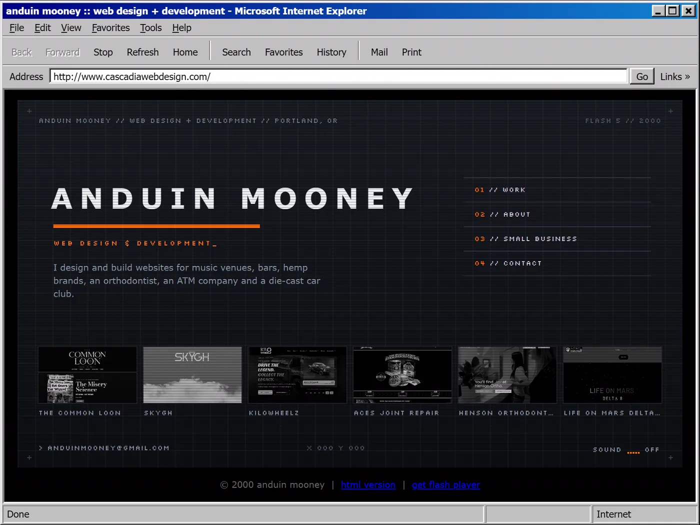
For a few years the most impressive websites were barely web pages. They were Flash movies: one file with its own fonts, animation and sound, behind a loading bar that counted up while it downloaded. My 1999 version lives inside a Flash 4 movie with rounded tabs, a grid of projects you roll over and a news ticker along the bottom. The 2000 version is Flash 5, in dark steel and orange, with a name that decodes itself and an intro. If your site had an intro, it also needed a Skip Intro button.
2001 to 2003: sliced images
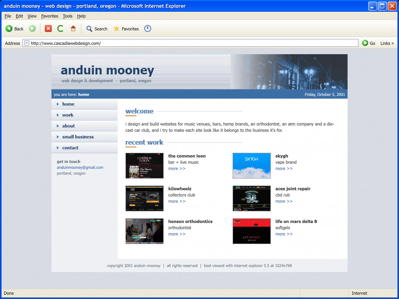
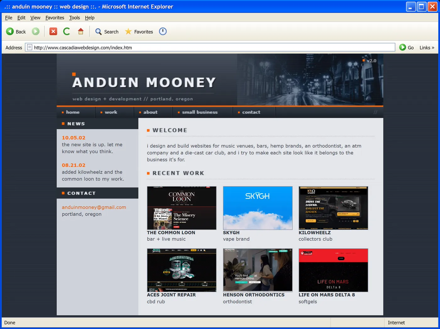
Designers drew the whole page as one picture in Photoshop or Fireworks, cut it into slices and let Dreamweaver stitch the pieces back together in a table. Every button was two images, one for normal and one for when your mouse was over it, swapped with a bit of JavaScript. Windows XP and Internet Explorer 6 both came out in 2001, and IE6 stuck around for most of the decade. In 2003 Safari 1.0 came out and CSS Zen Garden showed how different the same HTML could look with a new style sheet, so my 2003 version does its rollovers in CSS, even though the layout is still a table.
2004 and 2005: web standards
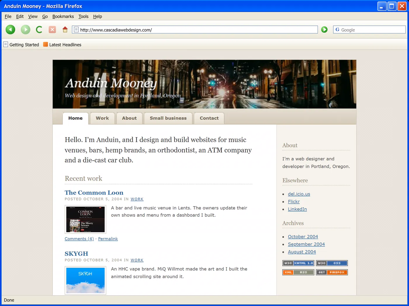
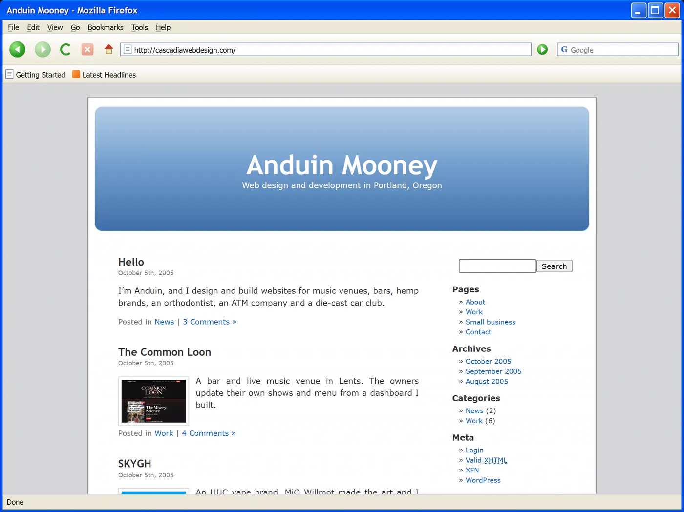
Firefox 1.0 came out in November 2004, and more people started building layouts with CSS in place of tables. That meant floats, image replacement for headlines, sliding door tabs and a long list of hacks to keep Internet Explorer from breaking the page. In 2005 WordPress made a theme called Kubrick its default, and a huge number of blogs ended up looking exactly like it. My 2005 version is one of them.
2006 and 2007: Web 2.0
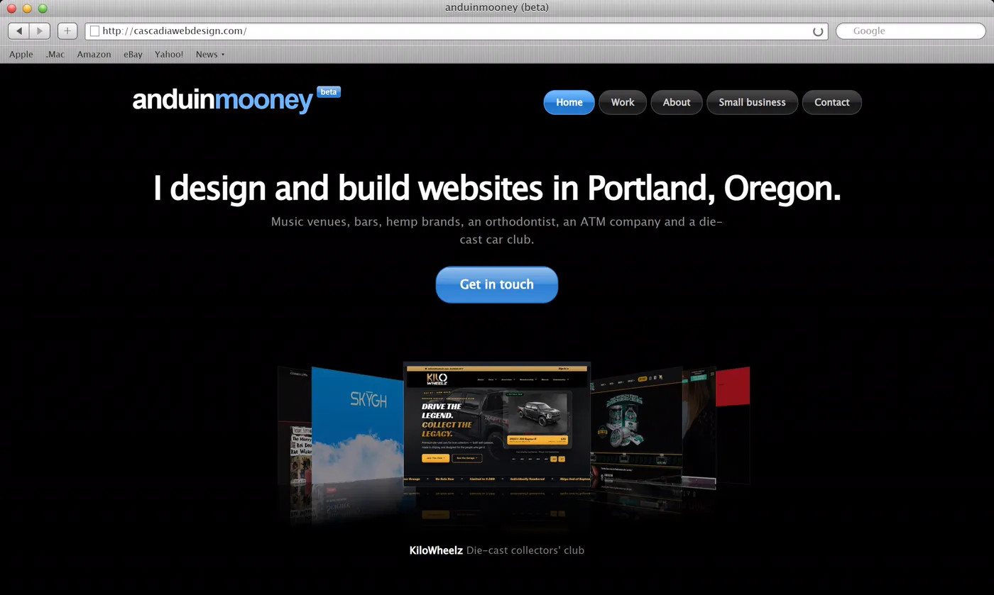
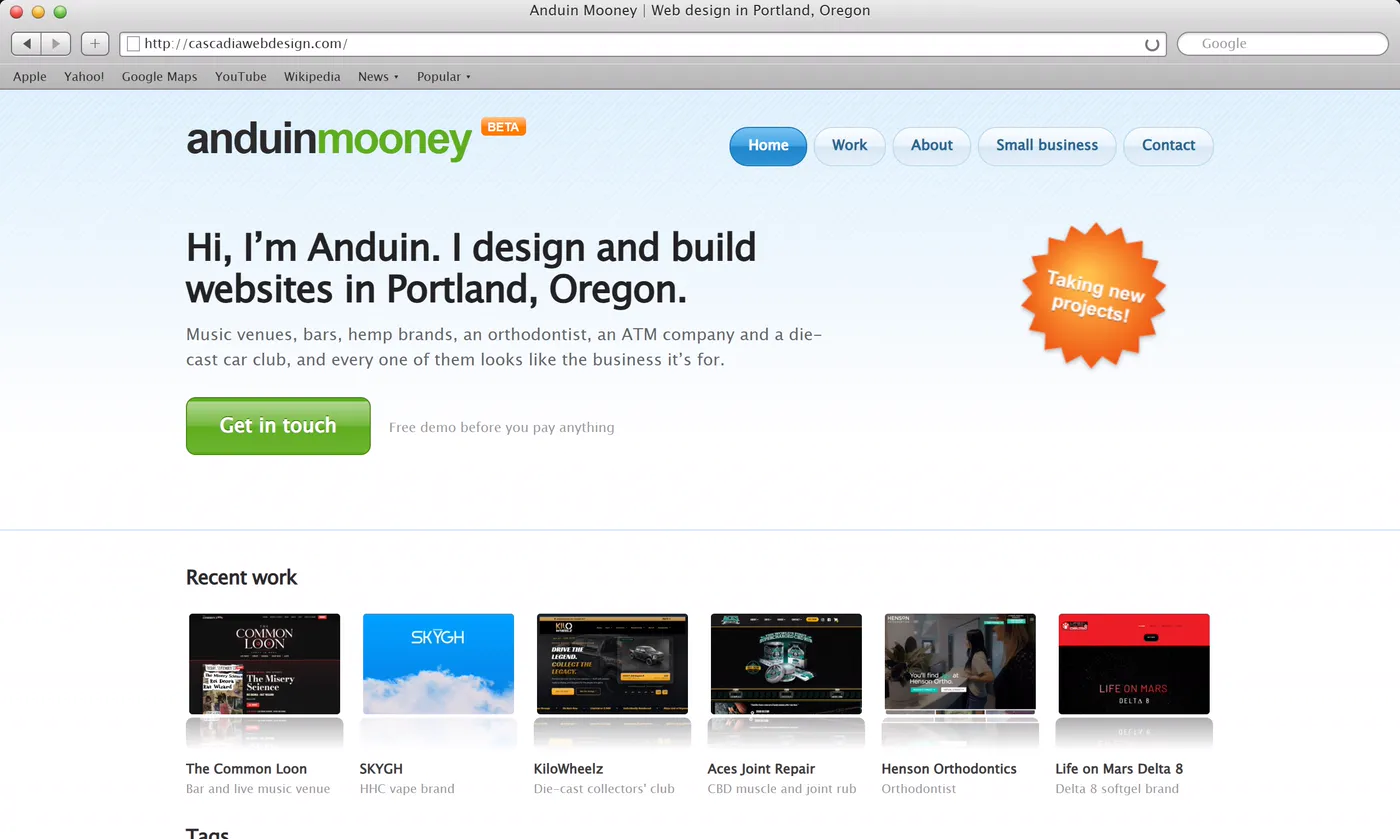
Web 2.0 sites were glossy. Buttons had a shine across the top, logos sat on reflections and anything new got a little beta badge. jQuery came out in 2006, iTunes had Cover Flow, and portfolio sites went black and shiny, so my 2006 version flips through my work in Cover Flow. In 2007 the first iPhone came out, and Firefox and Safari could finally round corners with CSS. Internet Explorer couldn’t, so it got square ones.
2008 and 2009: grunge and the 960 grid
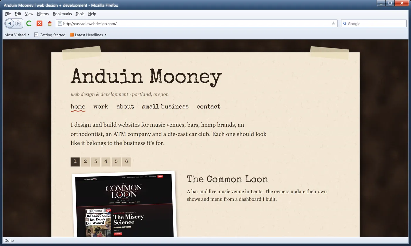
For a while everything looked like a scrapbook, with paper textures, tape and torn edges. Fonts on the web were still limited to whatever people had installed, so headlines were swapped for Flash text with sIFR and later for Cufón. The 960 Grid System lined everything up in neat columns, and nearly every portfolio had a big slider at the top. Google Chrome came out in September 2008 and Windows 7 in 2009, and my 2009 version runs in Chrome 3 on Windows 7.
2010 and 2011: responsive web design
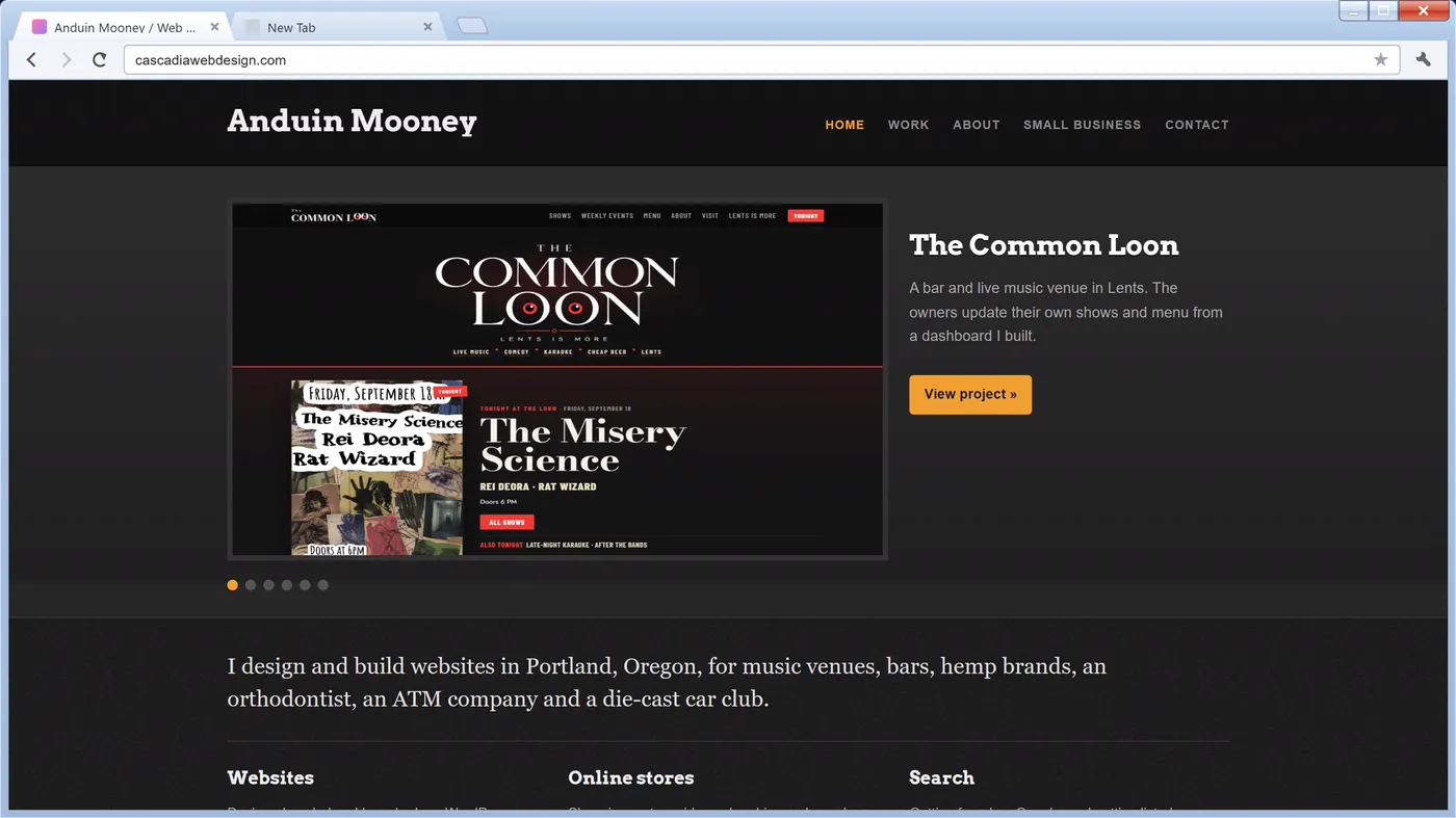
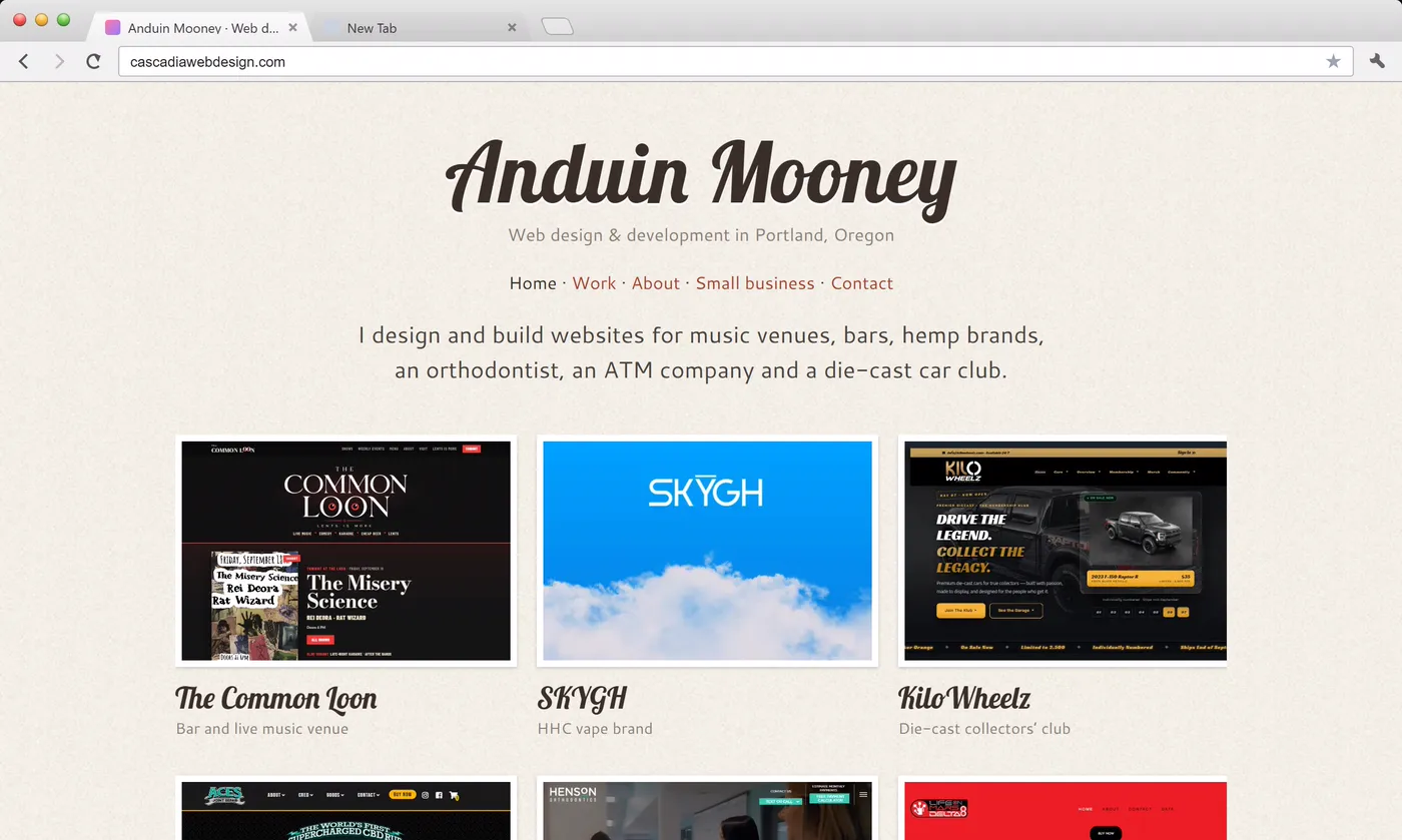
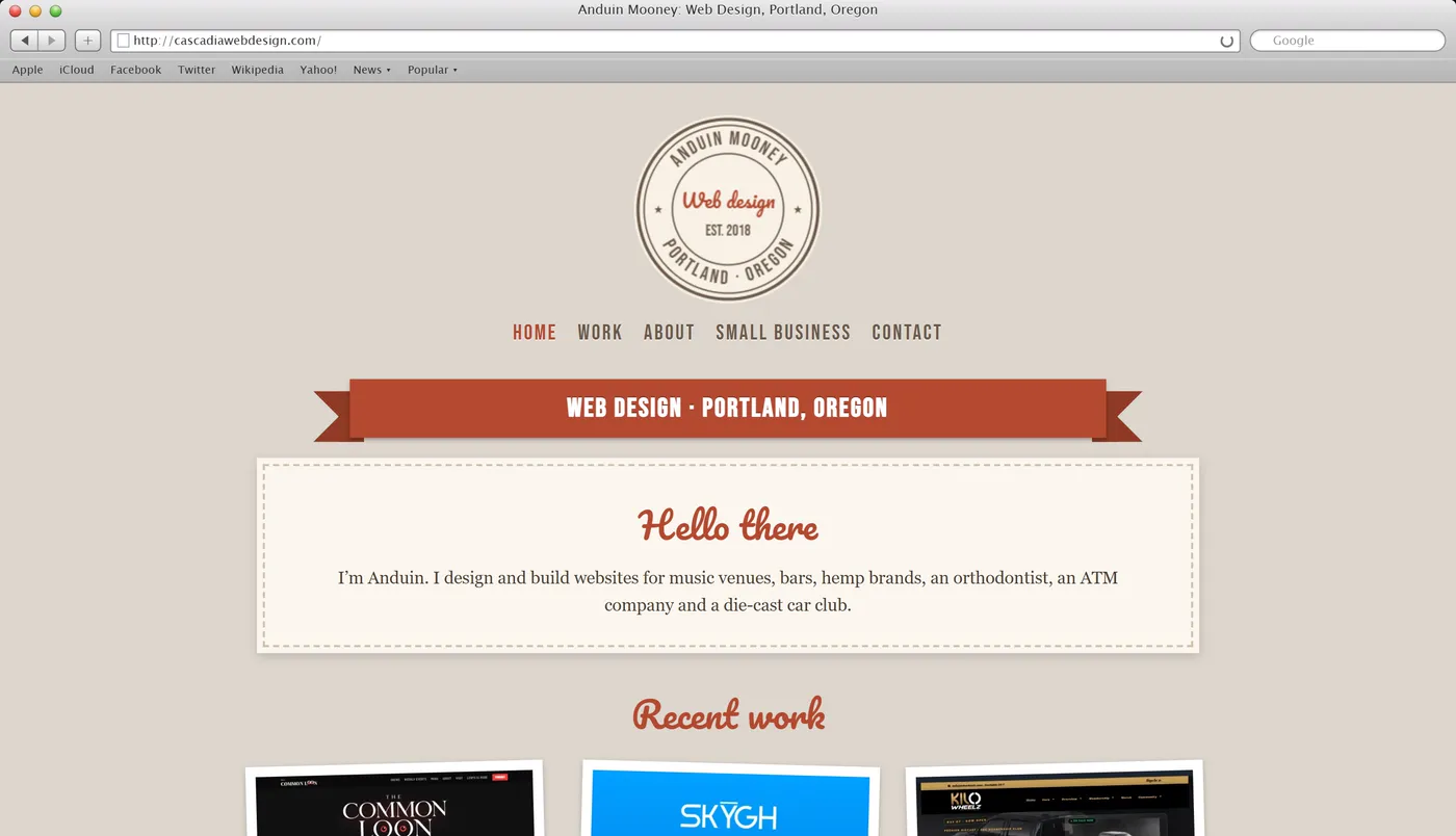
The iPad came out in 2010, and that May Ethan Marcotte gave responsive web design its name in an article for A List Apart. The idea was one layout that rearranges itself with CSS media queries for whatever screen it’s on, in place of a separate mobile site. My 2010 version does it, and on a computer you can drag the edge of its window to watch the layout change. In 2011 Mac OS X Lion arrived covered in linen, and the web got into looking handmade, with stitched edges, ribbons, badges and script fonts.
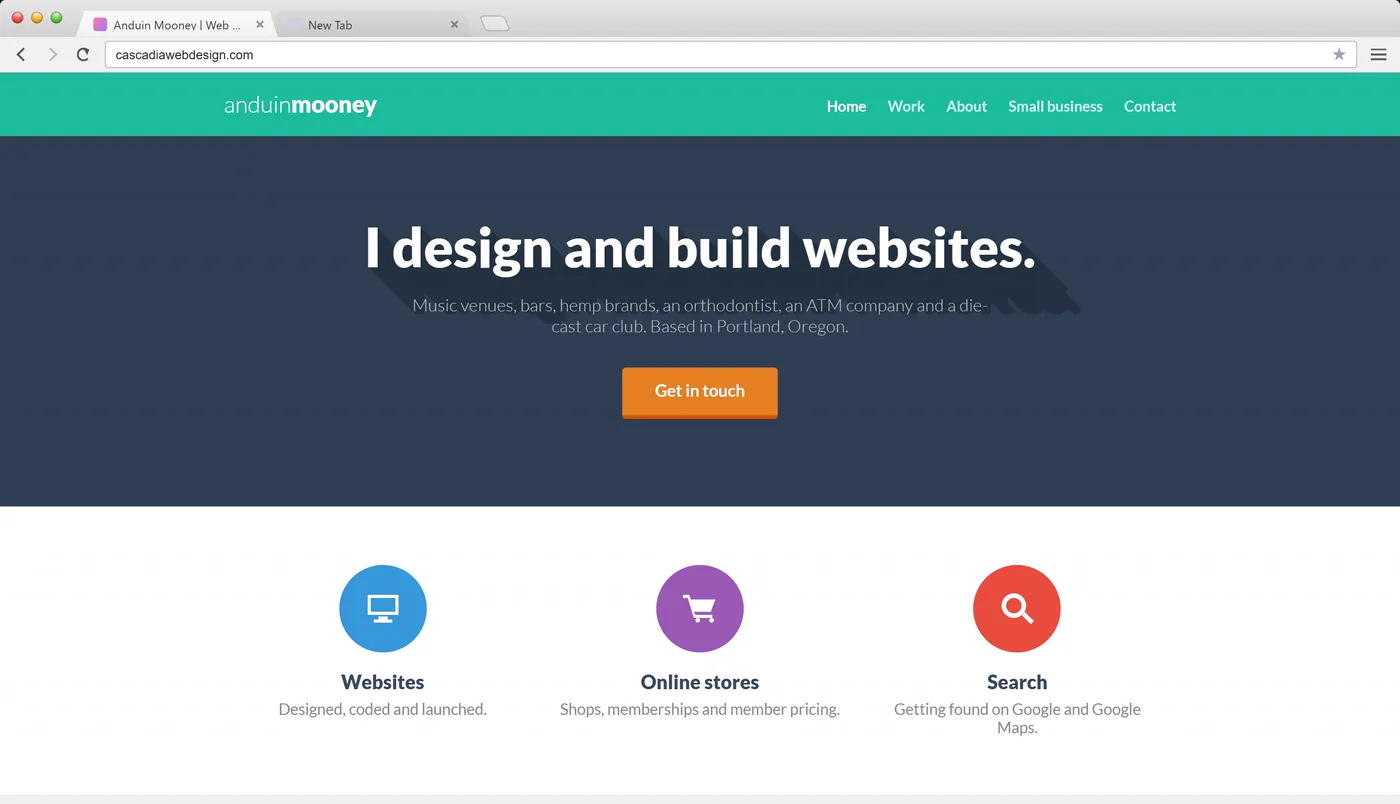
2012 and 2013: Bootstrap and flat design
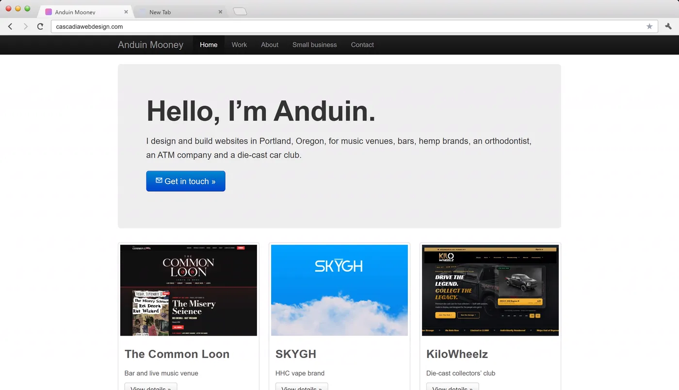
Twitter Bootstrap made it easy to put together a decent looking site quickly, and the same black navigation bar, big gray hero box and rows of thumbnails started showing up everywhere. Going through the years in order, this is where websites first start to look alike. In 2013 Apple made iOS 7 flat, and the web followed with solid colors, long shadows, Lato and full-width sections.
2014 and 2015: Material Design and the hamburger menu
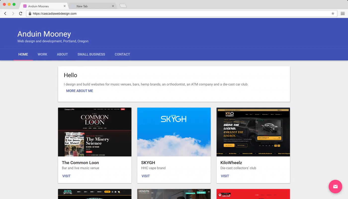
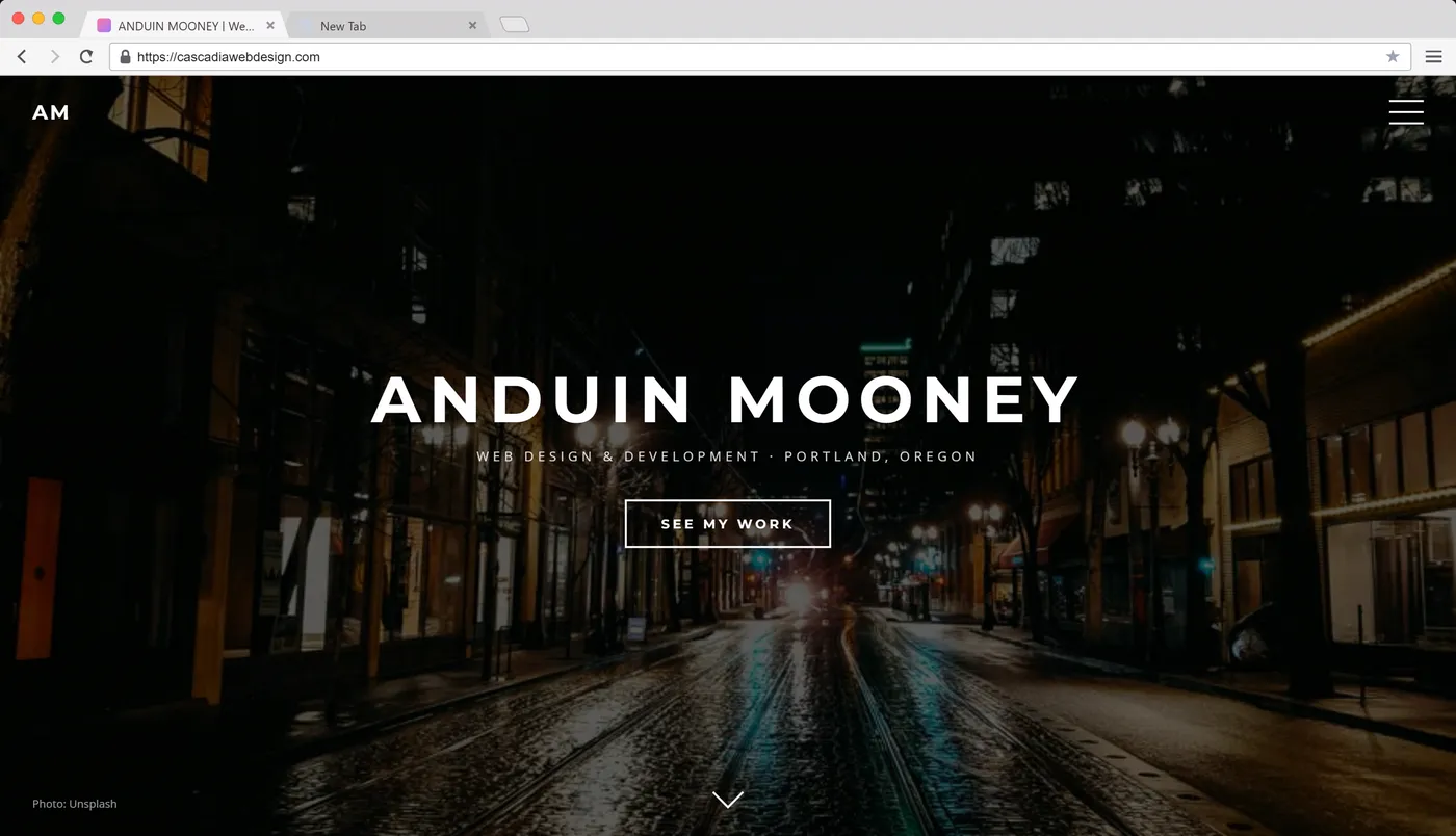
Google announced Material Design in 2014, and soon everything was a paper card with a shadow and a round button floating in the corner. By 2015 a lot of homepages were one full-screen photo with an outlined ghost button and a hamburger menu, and Flexbox finally made it easy to center something vertically.
2016 and 2017: brutalism and CSS Grid
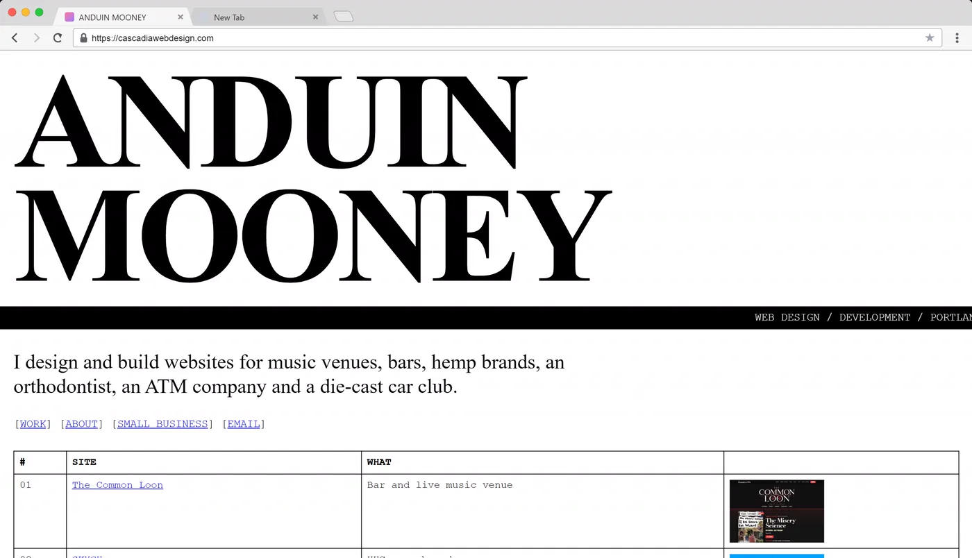
Some designers got tired of all that polish and went brutalist, with default fonts, blue underlined links, hard borders and even a marquee, all ugly on purpose. In March 2017 CSS Grid shipped in Chrome, Firefox and Safari, and layouts started overlapping because now they could.
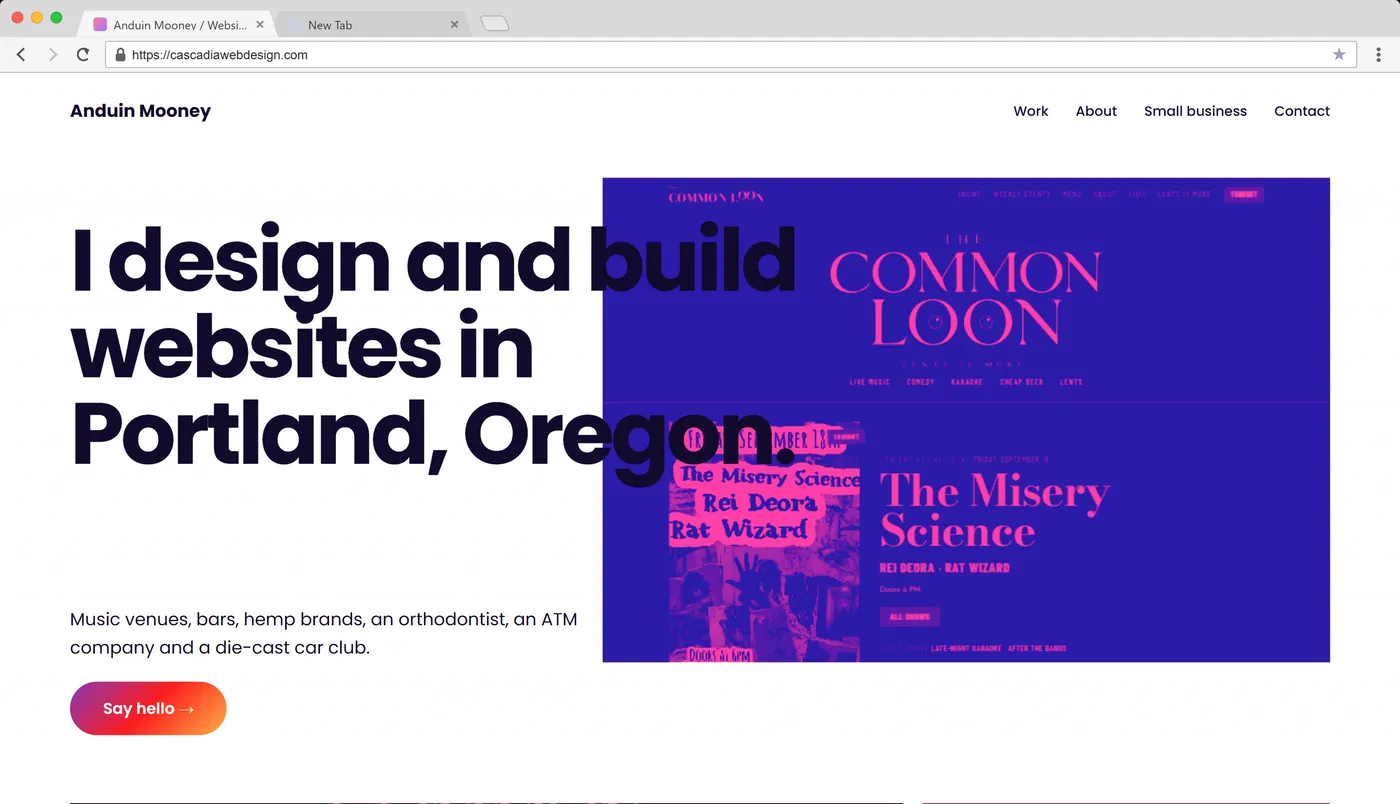
2018 and 2019: React, cookie banners and dark mode
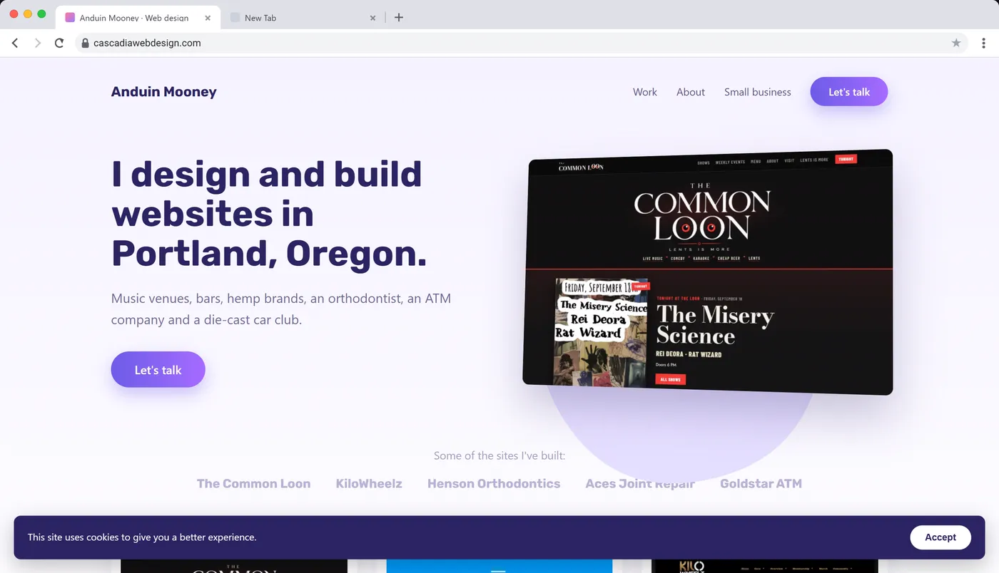
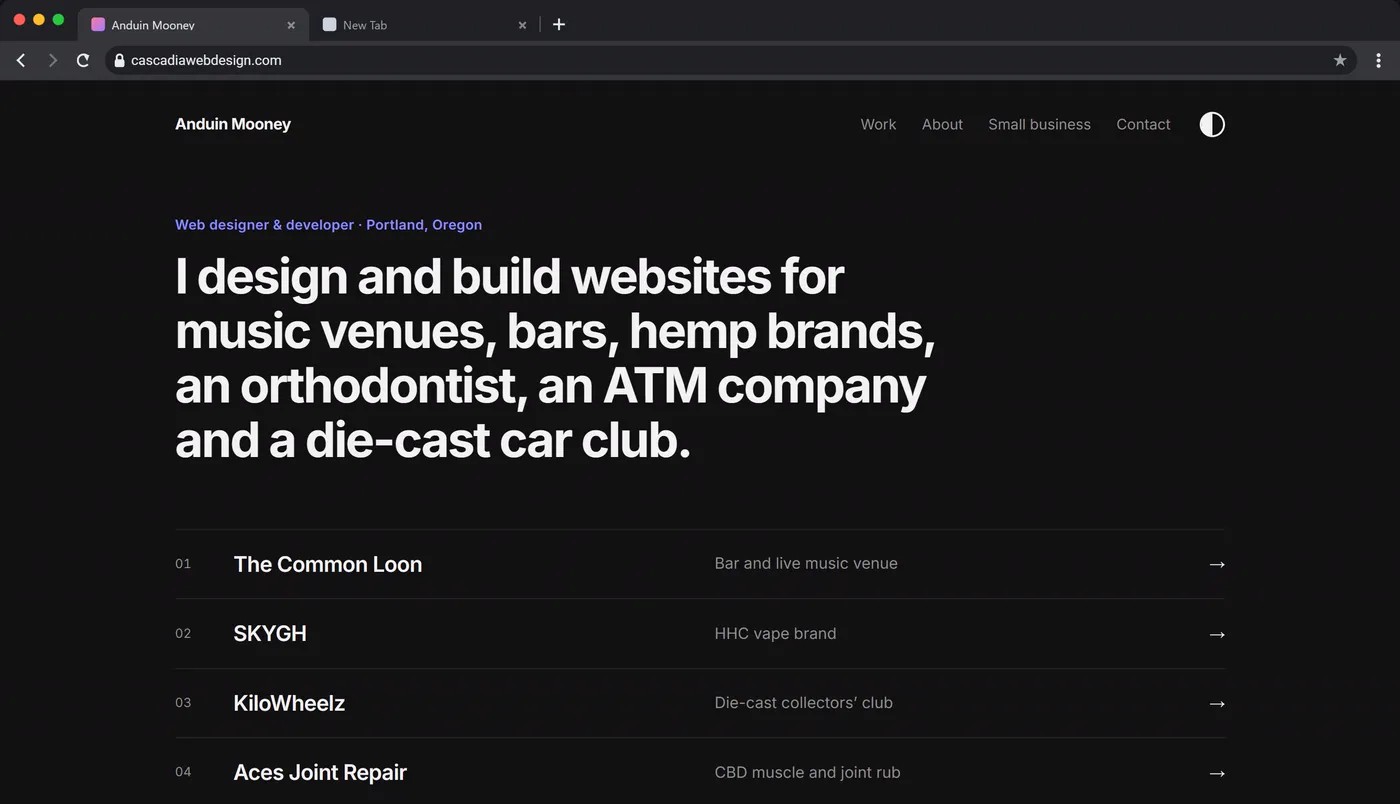
A lot of sites turned into React apps around this time, and CSS moved into JavaScript files. When Europe’s GDPR took effect in May 2018, cookie banners showed up across most of the internet, and my 2018 version has one you can accept. In 2019 dark mode came to iOS, and the big browsers learned to tell a site when you had it switched on, so one media query could flip a whole page to match. The 2019 version has a working switch.
2020 to 2022: the Dribbble years
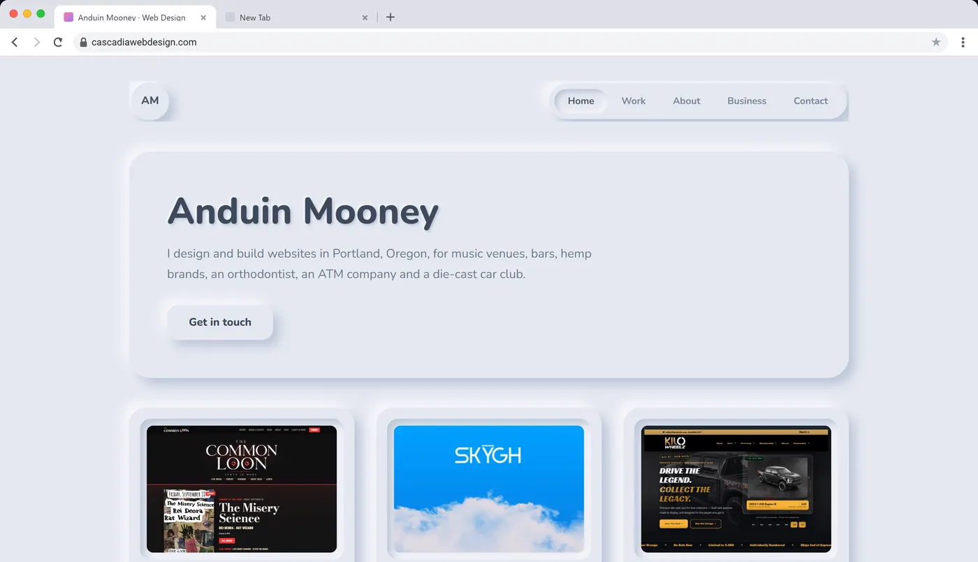
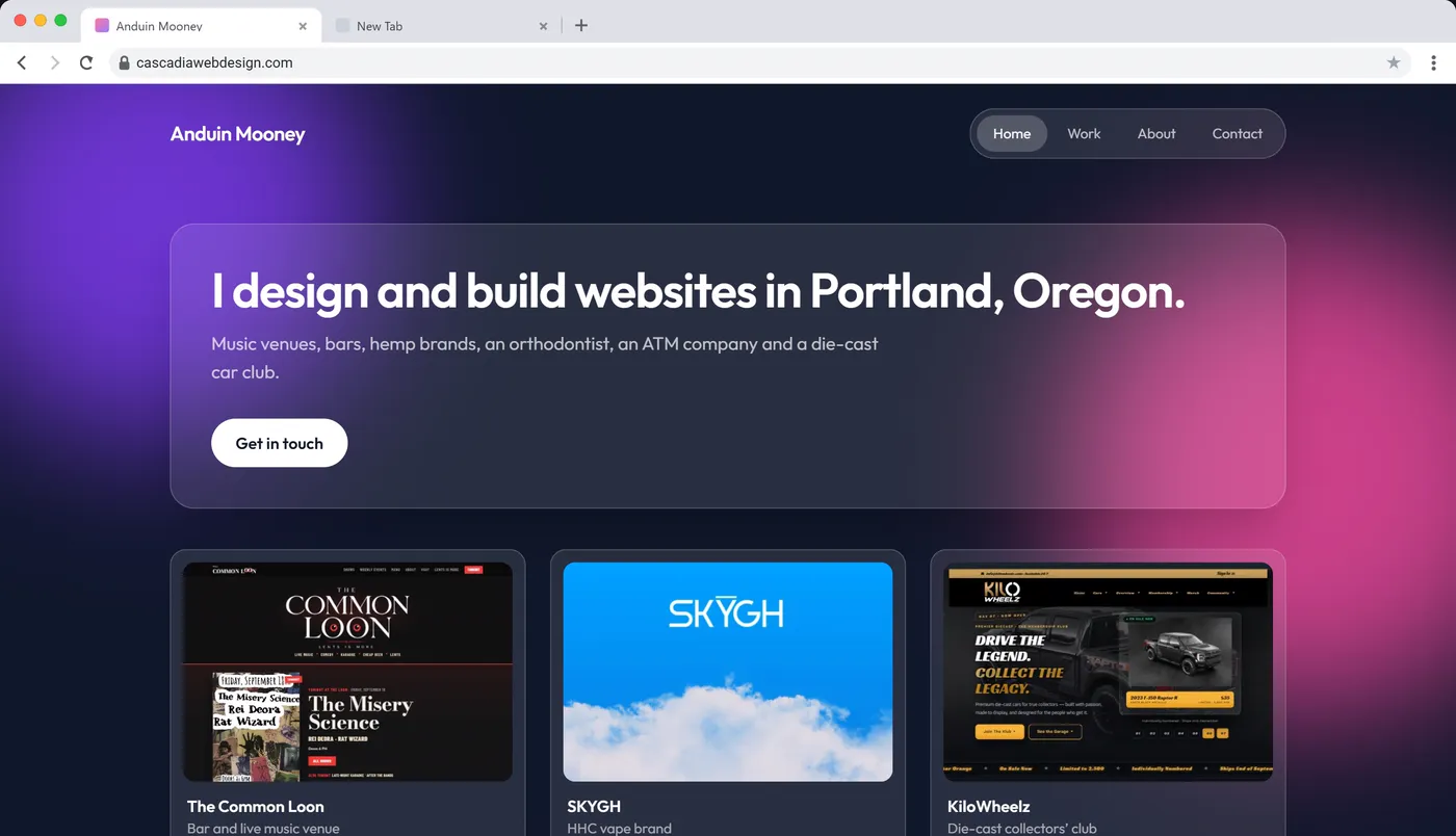
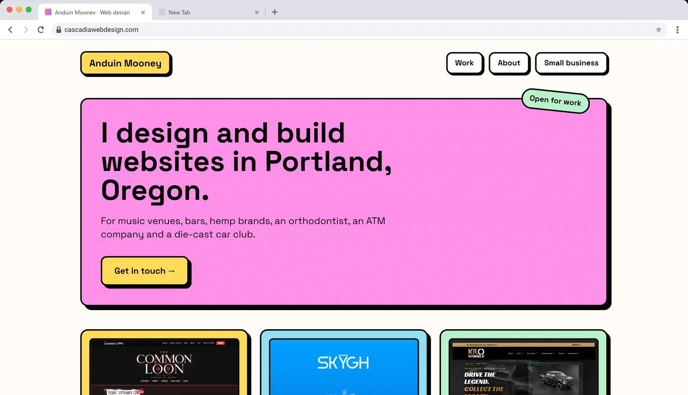
For a few years the trends came from design showcase sites like Dribbble as much as from real websites. Neumorphism made everything look like soft gray plastic with two shadows. Glassmorphism put frosted panels over blurry gradients, usually built with Tailwind. Then neubrutalism brought back flat bright colors, thick black borders and hard shadows, after Gumroad’s redesign in 2021 made the look popular.
2023 to now
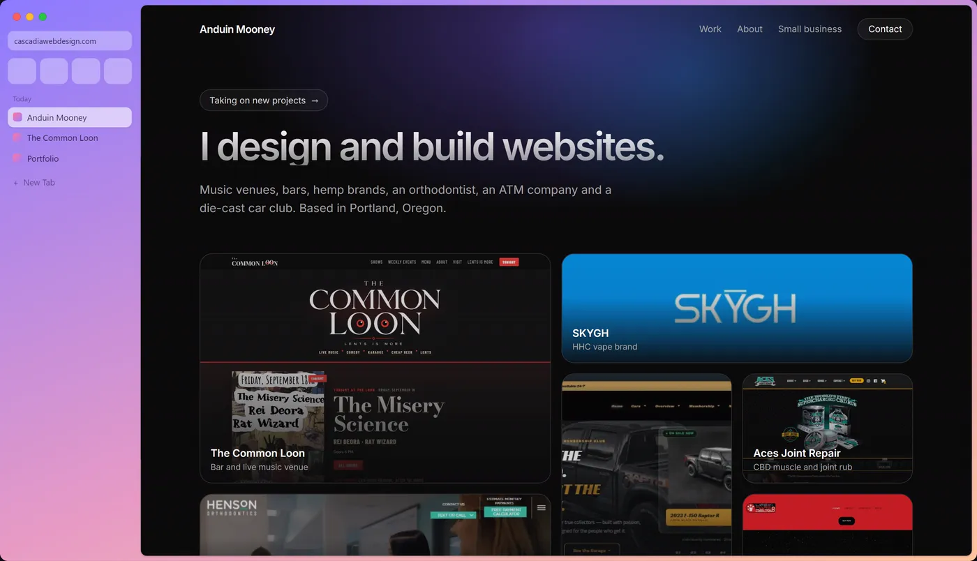
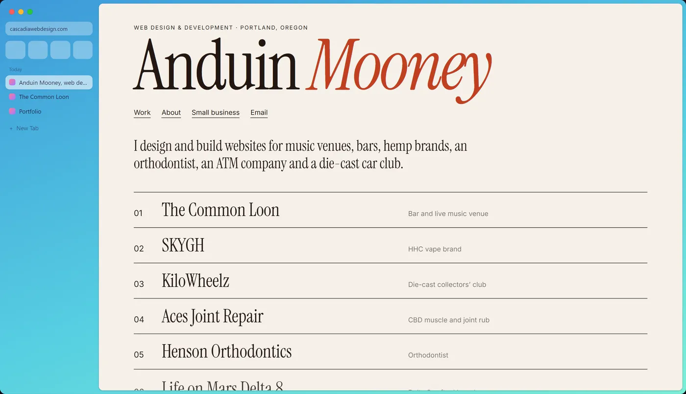
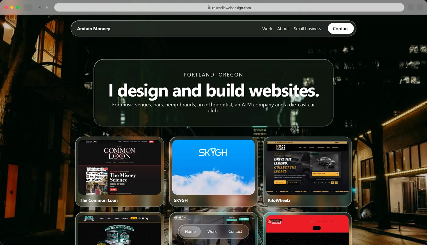
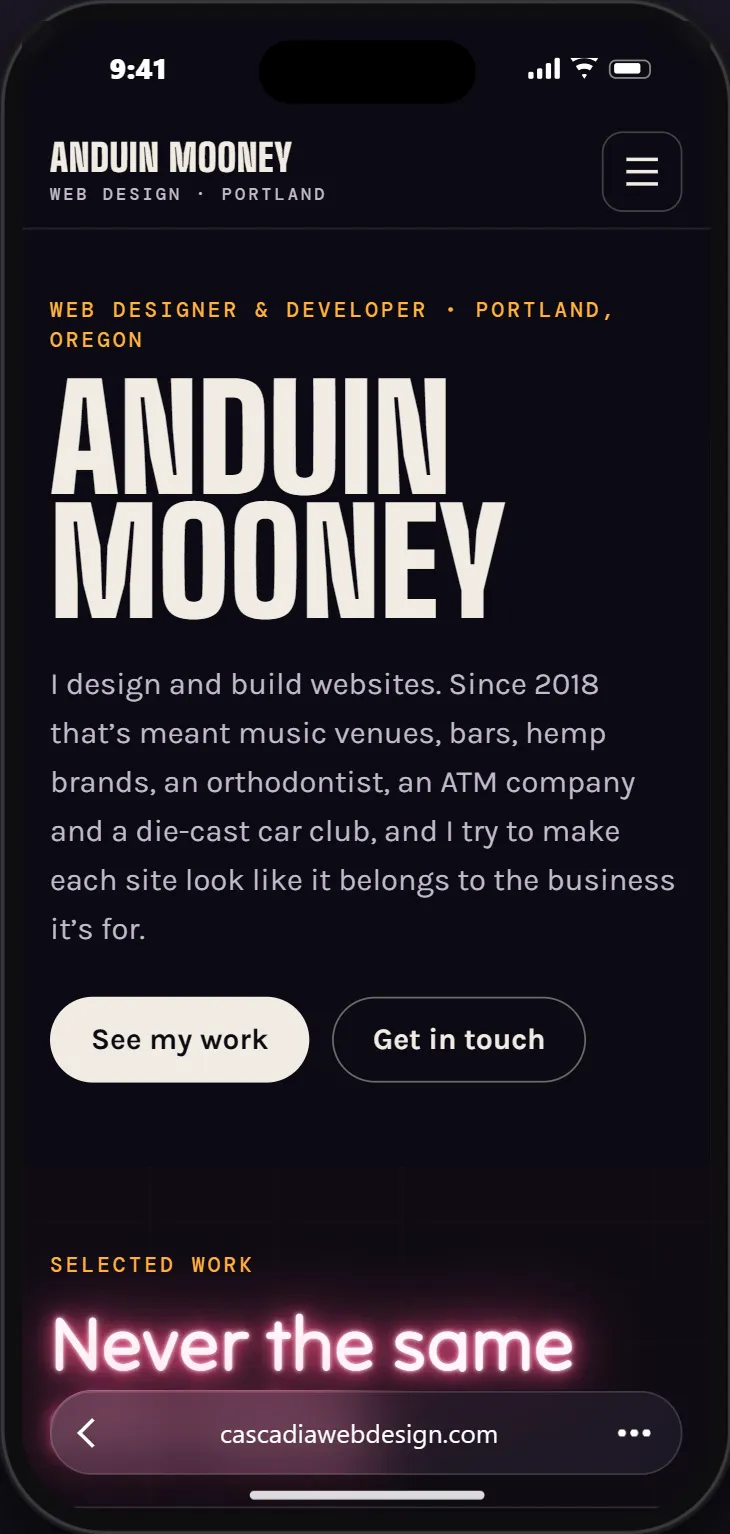
Dark pages, glowing gradients and bento grids took over, very often built with Next.js and Tailwind. At the same time plain CSS got good enough that a lot of sites don’t need a framework for layout or animation anymore. Nesting, :has(), container queries and scroll-driven animations all work in most browsers now. In 2025 Apple introduced Liquid Glass, translucent panels that bend whatever sits behind them, and my 2025 version has a panel that does that. The last version is my site as it looks today, on an iPhone, since that’s where most people see it.
Why so many websites look the same now
Seeing all 31 years in a row, what stood out to me was how different the eras are from each other. A 1999 Flash site and a 2006 glossy one look like they came from different planets. Every couple of years a new browser, a new screen size or a new tool changed what a website could do, and designers tried things with it, including some bad ideas like mouse trails.
From about 2012 on, the years start to blur together. Bootstrap, then premium themes, then website builders made it fast to put up a site that works, and most of them start from the same handful of parts. Now an AI site builder can write a whole homepage from one sentence. It will usually have a big headline, a line of text under it, a button, three cards with icons, a row of testimonials and a footer, because that’s the layout it has seen the most. The next business that asks gets nearly the same page with a different logo.
Those sites work on a phone and they load fast, and for some businesses that’s enough. They just don’t give anyone a reason to remember the business. People remember a website when it feels like the place they’re about to walk into or the thing they’re about to buy.
What that looks like for a real business
When I build a site, I start with what the business already has. The Common Loon is a bar and live music venue in Lents, so the homepage leads with the poster for tonight’s show, and the owners post their own shows and change the menu from a dashboard I built for them. KiloWheelz released a die-cast van painted black on black, so the KiloWeen page gives you a lantern to move over the van and see the artwork up close. The sample site I made for Sub Factory, a sub shop on SE Foster Road, has a time card on the homepage that tells you whether they’re open right now.
Each of those ideas came from the business itself, and that’s the part of web design I care about most. Rebuilding my own homepage 31 times was a good reminder of how much room there is to make a site look like the people behind it.
Questions about the history of web design
What did websites look like in 1996?
Most were built with HTML tables and FONT tags, often on free hosts like GeoCities. Tiled backgrounds, animated GIFs, under construction signs, hit counters and guestbooks were everywhere. Most people browsed with Netscape Navigator on a 640 by 480 or 800 by 600 screen over a dial-up modem.
When were Flash websites popular?
Flash sites and intros were everywhere from the late 1990s into the mid 2000s. Flash faded after the iPhone launched in 2007 without it, and Adobe stopped supporting Flash Player at the end of 2020.
When did responsive web design start?
Ethan Marcotte named it in an article for A List Apart in May 2010. A responsive site uses one layout that rearranges itself with CSS media queries for phones, tablets and computers.
What was Web 2.0 design?
Web 2.0 is the look of roughly 2005 to 2008: glossy buttons, reflections, soft gradients, rounded corners, big friendly type and beta badges, on sites built around sharing and comments.
Why do so many websites look the same?
Most sites are built from the same frameworks, themes and site builders, and AI site builders tend to produce the layout they’ve seen most often: a headline, a button, three cards and a row of testimonials. A site designed around one business, with its own photos, words and features, is easier to tell apart and easier to remember.
Can I see all 31 versions?
Yes. They’re on my After Hours page as Since ’96. Each year runs in a copy of that year’s browser and is written in the code of its time.